MURICO.com Forum
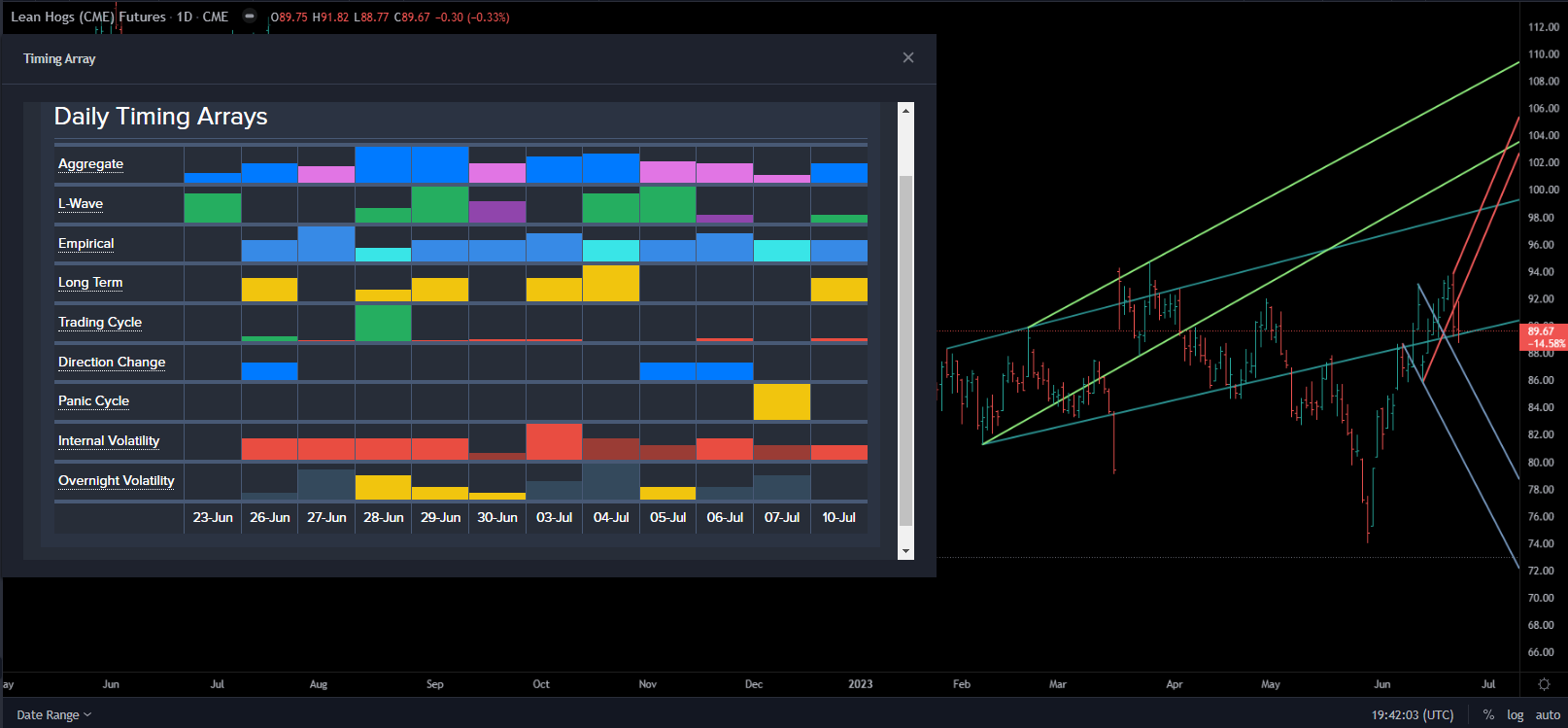
This is the array with the chart from Socrates,
Those green Trading Cycles suggest that a should be established...
The Trading Cycle row represents a model that searches for instances when time and market price direction may align based on cycle counts.
Unlike the other Array rows that alternate between two colors to show a change, the Trading Cycle colors have a specific association from the model:
A red bar indicates a bearish cycle count of time units from the last market high. The higher the red bar, the higher the cycle counts relative to other time units, which indicates the possibility of a market establishing a relative low.
A green bar indicates a bullish cycle count of time units from the last market low. The higher the green bar, the higher the cycle counts relative to other time units, which indicates the possibility of a market establishing a relative high.
A yellow bar indicates when bullish and bearish cycle counts converge on the same time unit. The higher the yellow bar, the higher the cycle counts relative to other time units, which indicates the possibility of a relative market high and low in the same time unit.